Physical Assault stats in Australian States and Territories
Alternative title: How Brad Battin, Sussan Ley and David Crisafulli inspired me to learn Matplotlib at 1am
The Inspiration
A woman was stabbed in Melbourne this week and various LiBellends have claimed that Melbs is the “crime capital” of Australia.
Victorian Opposition Leader Brad Battin: “There’s no-one in Australia that’s close to us. Victoria stands alone.”
Federal Opposition Leader Sussan Ley says she is not exaggerating by saying Melbourne has gone from the “most liveable city” to the “crime capital” of Australia.
Queensland Premier David Crisafulli: “I’ll tell you another thing I can offer. If they live in Melbourne, they’ve got a place that’s dealing with youth crime, and they won’t get stabbed. That’s a good start.”
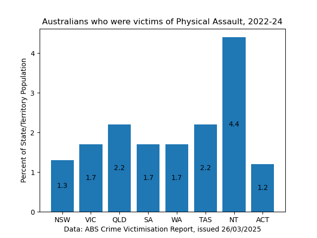
The Data
I had a look at The latest ABS Crime Victimization report, which showed that violent crime was similar in most states and territories, apart from the NT which was significantly worse than the others. Queensland’s rate of violent crime was actually higher than Victoria’s, despite Crisafulli’s comments.
Recently I’d been thinking about the R charts and videos I did during the 2020-2021 lockdown era, and wondering if Python data visualisation would be a bit easier now I have even less motivation to do anything. A simple bar plot of the data by states might be a good first example.
The Code
import matplotlib.pyplot as plot
import numpy

fig, ax = plot.subplots()

# Data from https://www.abs.gov.au/statistics/people/crime-and-justice/crime-victimisation/2023-24#state-and-territory-statistics
# These are in percent of population over 2022-24
states = ['NSW', 'VIC', 'QLD', 'SA', 'WA', 'TAS', 'NT', 'ACT']
victim_rates = {
   'Physical Assault': [1.3, 1.7, 2.2, 1.7, 1.7, 2.2, 4.4, 1.2],
# Decided last minute to leave the above on it's own to not complicate things
#    'Face-to-face Threat': [1.8, 2.0, 2.6, 1.8, 2.5, 2.3, 4.9, 2.2],
}

# Yes we have to calculate bar stacking ourselves apparently
bottom = numpy.zeros(8)
for crime, rate in victim_rates.items():
   bars = ax.bar(states, rate, label=crime, bottom=bottom)
   bottom += rate
   ax.bar_label(bars, label_type='center')

# ax.legend()
ax.set_ylabel('Percent of State/Territory Population')
ax.set_xlabel('Data: ABS Crime Victimisation Report, issued 26/03/2025')
ax.set_title('Australians who were victims of Physical Assault, 2022-24')

plot.show()